In a press announcement this past Friday, President Rosenberg revealed a major change to the branding of Florida International University. The official school colors will now be zebra and leopard print, replacing the longstanding Blue and Gold.
“Yes, they’re not exactly ‘colors’ in the traditional sense,” Osvaldo Ferrell, Director of FIU Marketing, told Bacon reporters, “But we felt that these patterns best represent FIU’s worlds ahead status, while retaining an exotic and upmarket feel.”

The print that will be used as the official FIU logo (click image to enlarge)
Mr. Ferrell showed us different arrangements of the pelt prints in the shape of the FIU logo. “This is the one that will most likely be chosen. This is a giant step into the future for FIU.” Ferrell said, holding up a particular print.
This change in FIU branding marks the forty-third major renovation of the FIU image in the university’s lifetime. We decided to dive deeper into the history of FIU branding to understand why the University has had so many facelifts over the years, and why it has decided to do so once again.
“As you know, FIU began as a technical school, for aspiring pilots. That’s why it was built on an old airport.” Says Aaron Cummings, a FIU Police Officer charged with keeping an oral account of FIU’s history to pass on to the next generation.
“So the first set of branding was geared toward big, handsome pilots. Then, when the pilot program crashed, FIU decided to change its image. It went from Flight Institute University to Florida International University. And the mascot changed from Petey the Pilot to The International.”
FIU underwent many more transformations as it grew through the years. Finally, in 2009 FIU arrived at what seemed like a suitable and stable branding. The placid and slothful looking panther was transformed into a raging panther, and later in 2012 the tagline “We Have Air Conditioning” was added. Now with these elements in place, FIU has once again decided to change a major element of their branding.
“As FIU’s official Oral History Performer, and its leading Fashion Officer, I can say without a doubt that the latest change to FIU branding is fabulous.” However, not everyone is as enthusiastic as Officer Cummings. Some students and faculty have come out against the change in colors.

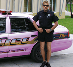
New FIU Parking Decal (click image to enlarge)
“This is outrageous,” says Daniel Bartolommeo, an adjunct professor, “I’m not putting a parking decal with that logo on my car! I don’t care if they ticket me, that thing is hideous.”
Serra Jennings, a transfer student from MDC, had this to say, “I came from the MDC Kendall campus, which is a depressing gray. So I came here thinking the blue and gold was going to be a nice change of scenery. But now it’s too much, the banners they put up are so busy with zebra and leopard patterns – it hurts my eyes.”
Despite the naysayers, FIU marketing has started printing banners and posters promoting the new FIU look. “We won’t stop there,” Osvaldo Ferrell told us, “We plan on putting the patterns on the Green library and the new giant parking garage that will replace Tamiami Park.”
The goal, Mr. Ferrell tells us, is to get FIU branding to a unique and recognizable standpoint. They are aiming to have the zebra and leopard print patterns synonymous with FIU.
“Fruit Stripe Gum? FIU. Lisa Frank artwork? FIU. MC Hammer Zubaz? FIU.” Then Mr. Ferrell added, with a notable proud look, “In fact, we want our branding to be so prominent that when people in Africa see an actual zebra or leopard, their minds are immediately brought to FIU. Now that’s Worlds Ahead.”


